Context
For nearly 20 years, Delhaize, one of Belgium’s oldest and most iconic supermarket
chains, has been our client. The brand required a new private label brand and
packaging architecture for its two private label ranges. The aim was to craft a
distinctive visual identity that reflects Delhaize’s core values and reinforces its
market leadership: rejuvenation, clarity, and strength.
Insight
Consumers are overloaded with information when they walk through the aisles of
supermarkets. They are looking for products that meet their needs for quality and
affordability while being easily recognizable to balance with everyday life.
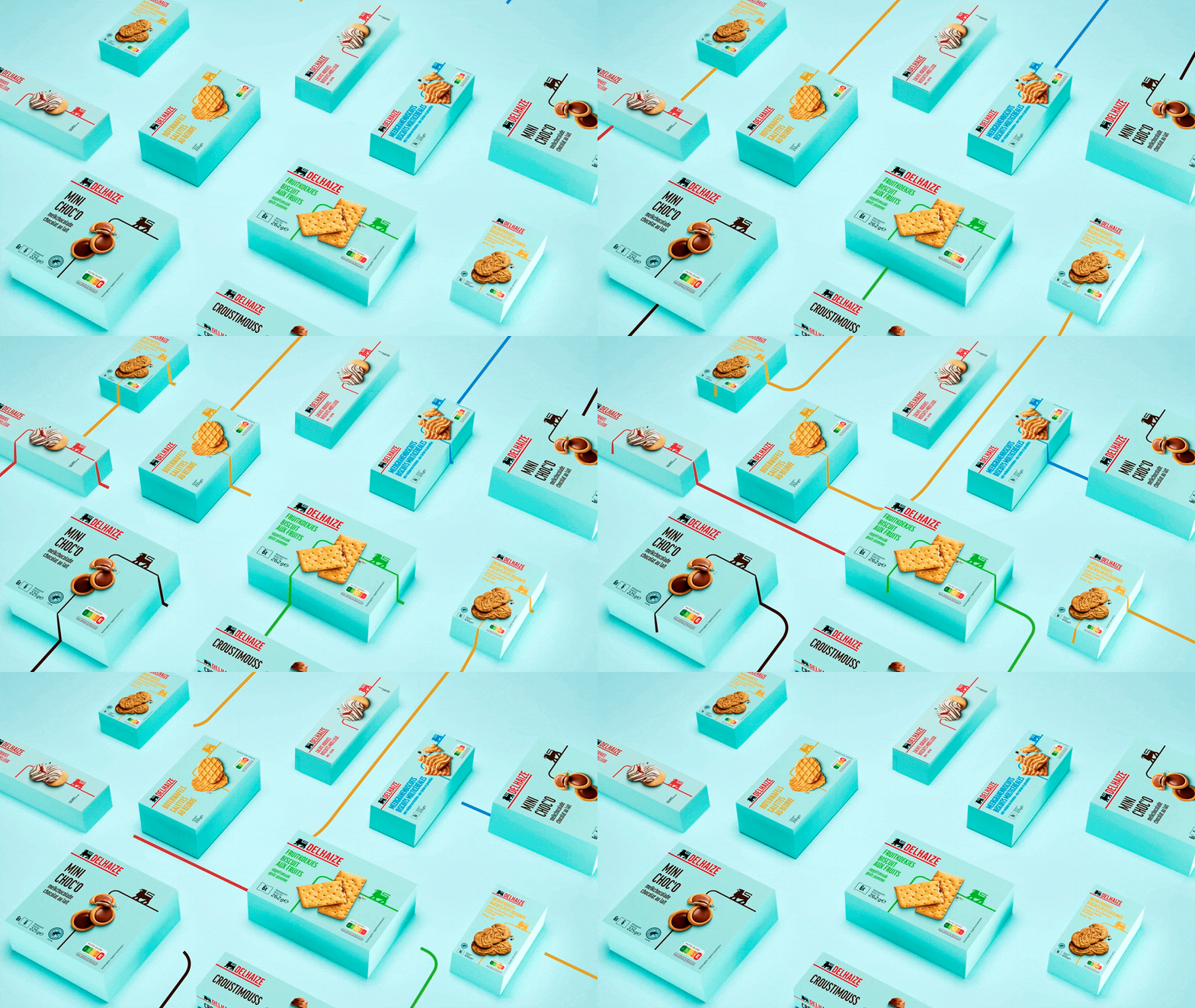
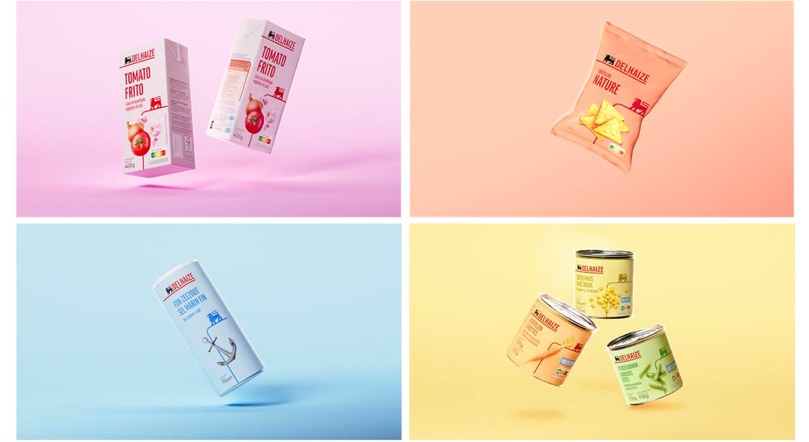
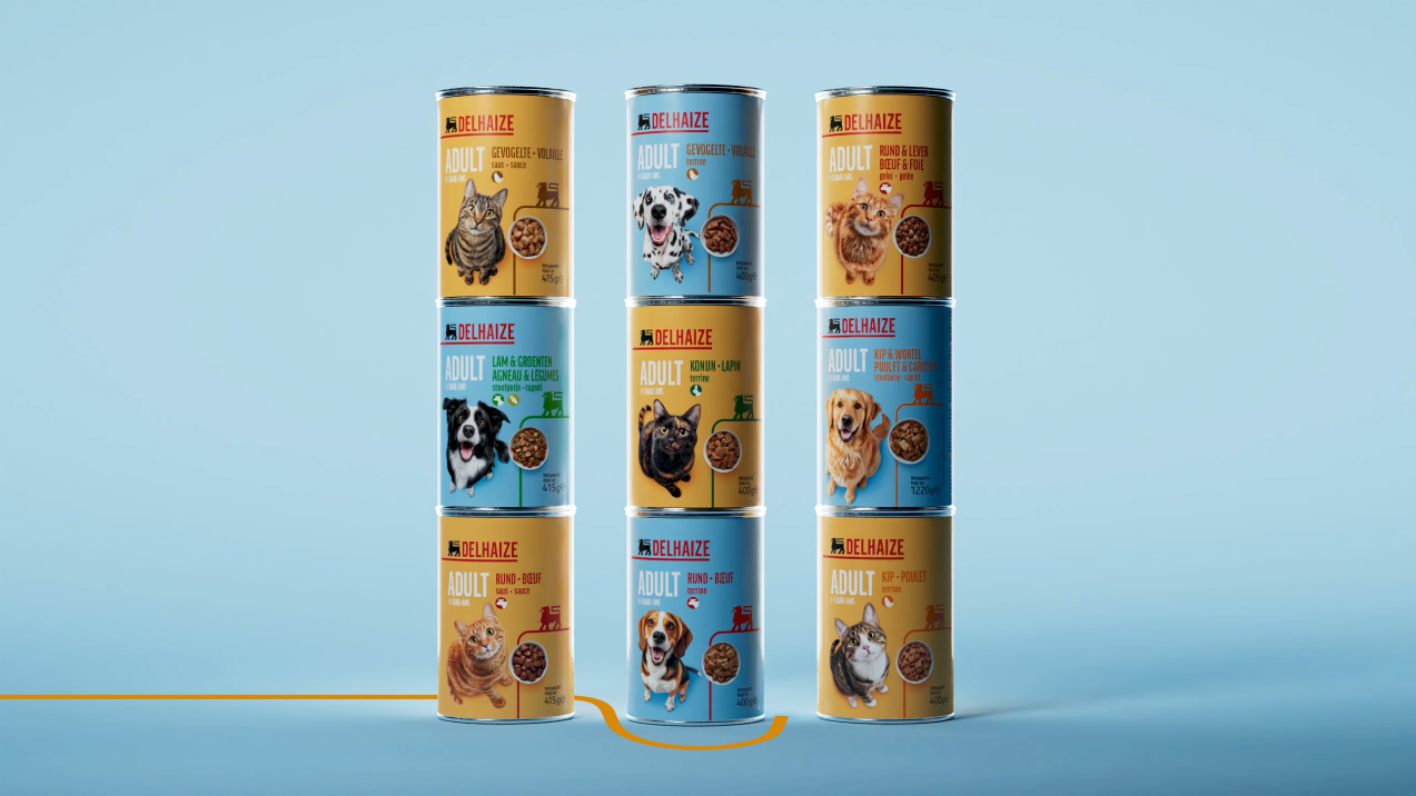
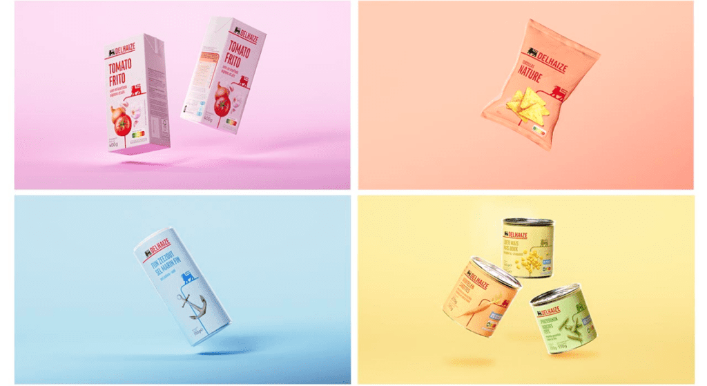
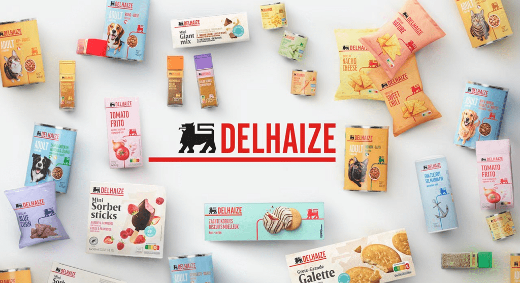
When shopping at Delhaize, you recognize the private label products instantly,
thanks to their unique branding and color differentiation.
Solution
Because we live in a world of excess, we wanted to do better and help our
consumers. Instead of simply creating a design, we invented a method to apply to
the new private label and brand packaging architecture: The L.E.S.S. Method:
Liberate the lion, Exciting, Sobriety, and Sustainability.
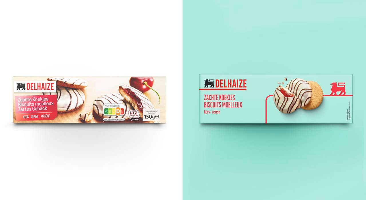
The result? This redesign emphasizes qualitative yet affordable products that meet
consumer needs and reflects Delhaize’s objective to create a distinctive customer
experience with clear visual codes for its two private label ranges.

let's work
on a project together
Contact us
One group - 4 offices
International
Icom
.becoming is a member
of the ICOM network for over 25 years
and Presides over Europe